- PatrickWizardCO2 Saver

I like the 'Add Accounts' button at the bottom of the actual list of accounts. It makes a lot of sense.
In their current position, when you have multiple Bunq subscriptions (for example both Personal and Business), the location has some downsides:
- The blue plus icon is very obtrusive, asking for attention (this might take getting used to)
- The button pushes down the other subscription, taking valuable space
Because adding an account is not something you do every day, it would be helpful to move them to a less obtrusive place.
Suggestions:
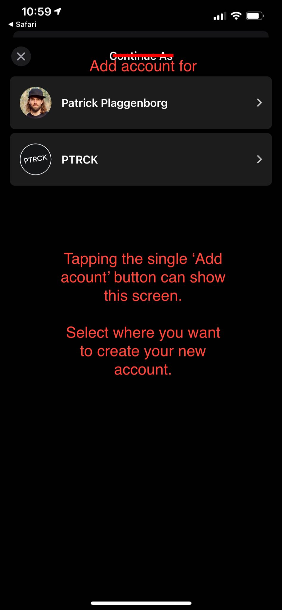
- combine them in a single Add Account button below the bottom most account
- Tapping 'Add Account' can then ask 'For which subscription?' First, and then follow up with the existing add account screens.


