 PepijnRookie
@Walter-Pink-Turtle#173064 En snel een beetje
@Walter-Pink-Turtle#173064 En snel een beetje
Suggestion:
- Spot what bank account a transaction was made on the detail screen (used to be there in V2)
- Bring back adding notes to transactions
@jojost1#177539 Spot what bank account a transaction was made on the detail screen
That is one of the biggest things I miss at this moment... to see who paid what and from which account.
Guys and girls, don’t worry. I think I know what went wrong. They accidentally uploaded some kind of internship project. Probably V2 will be available again next week
Back to V2! There is absolutely NOTHING I like about this update. Way to annoy everyone
Ich glaube ja immer noch, dass bunq gehackt wurde, und ein 12 jähriger seine Wetter App in den Store gestellt hat.
V3 is not a change management issue on users but a total and complete fail. Funny how it went into and out of beta in record speed. Now I'm on the search for a new bank, damn
PSD2 makes it inevitable that people end up using 3rd-party apps for banking with their Bunq accounts. Banking and banking apps will be increasingly separate.
Putting so much effort into a completely new app does not make sense, unless Bunq wants to compete in the banking app space rather than the banking space.
IMHO they would do better to invest in their API's and become the favored banking provider of these upcoming 3rd-party apps. Meanwhile continuing to maintain V2 and slowly evolve it in small iterations.
Was wirklich eine Frechheit gegenüber langen und treuen Kunden ist, ist dass die Notiz Funktion nicht mehr für Premium Kunden zur Verfügung steht. Ohne Vorankündigung, einfach gestrichen.
Wirklich eine große Frechheit, auf eine Pressemeldung wartet man vergeblich. Sonst ist der CEO doch immer Kundennah unterwegs gewesen, warum die Kehrtwende?
@dominiq#177309 I'm also looking forward to an official statement. Based on V2 and the last 2 years (not including the green-marketing stuff) I would really like to stay a customer. But not with this v3 app.
@RonP#177584 Notizen zu Transaktionen? Wenn du das meinst, dann kann ich dich beruhigen. Die gibts noch ist nur etwas schwerer zu erreichen. Wie sehr viel in V3, und zwar über das große Plussymbol. Innerhalb einer Transaktion klicken > voila „Notiz hinzufügen“.
@Marc-Cyan-Dolphin#177592 Je kunt een transactie ook naar links vegen. Daar zit de optie van notitie toevoegen ook.
@jojost1#177539 - Bring back adding notes to transactions
You can left swipe on a transaction to add a note. Or you can open the transaction details and click the + button.
On iOS, there is a known issue that you can't add notes to iDeal payments.
@jojost1#177539 - Spot what bank account a transaction was made on the detail screen (used to be there in V2)
That seems like a good suggestion to me!
@wesselt#177600 Adding notes seem to be a Supergreen-only feature now.. WHAT?! That is insane. I pay 8€ a month.
@jojost1#177610 Ik heb premium en heb gisteren nog notities toegevoegd aan pin betalingen. Met iOS lukt het nog niet bij iDeal betalinge
Posting for statistics. I dislike most everything about V3, everything takes more clicks now. I dont want insta in my banking app. One month, if it hasn't changed significantly by then, I'm out. Very sad to see this as I went out of my way to recommend bunq to my friends and colleagues and I feel like a hack now.
@Petrus-Orange-Puma#177613 The App Store version does allow notes, thanks. The TestFlight stopped updating and that version didn’t allow it. Bunq should probably expire the TestFlight build.
@Sebastian-Aquamarine-Penguin#177617 Same here. I have really promoted bunq. Not anymore.
An feature I would REALLY love is to add external credit cards, e.g. AmEx to see balance and transactions.
For V3;
❤️ Light mode
❤️ Disable the counters for trees and savings (setting)
❤️ full transaction overview (independent of account)
❤️ Option to disable, hide or replace US
And:
🌈🌈 Create your own menu 🌈🌈
My stock broker has this: I can determine myself what i want the bottom menu buttons to be
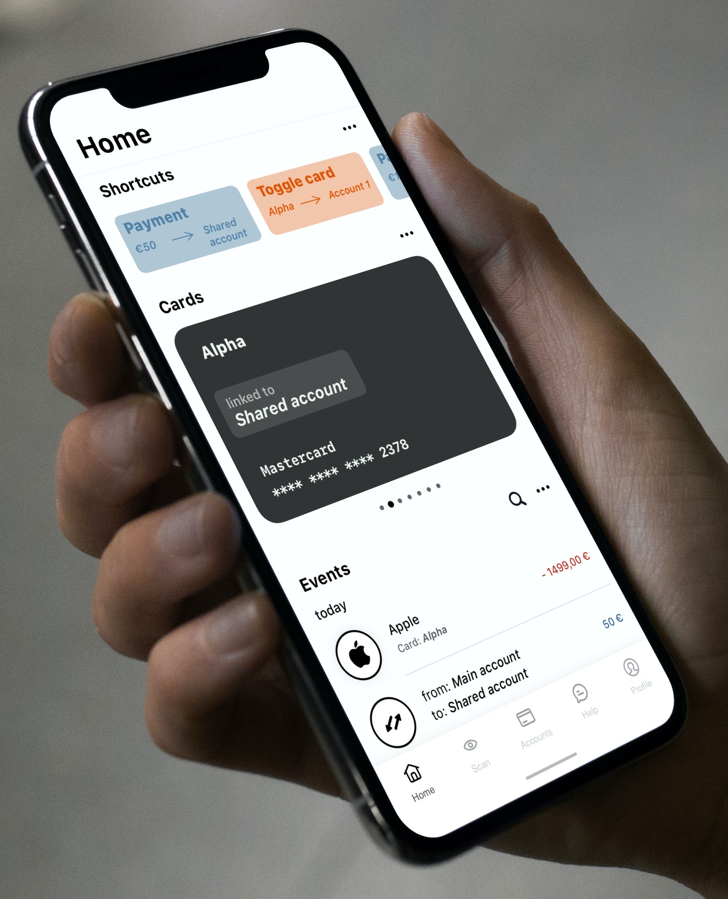
I did a quick mockup of what I think the homescreen should look like. I'm not saying this should be exactly it, but functionality-wise you want a home screen where most of the information you need most of the time is present. 'Cards' don't necessarily need a separate tab-bar icon, but 'Accounts' do. The 'Accounts' screen should have specific controls for payment and request and insights. The current V3 has to much going on in one area of the app.
Quickly toggle a card between two accounts. Quickly do an often made payment.
You don't have to see all the cards at once. It is too convoluted and your brain can't process it easily. Also, you want to see all relevant data about a card in one glance.
This would be the 'global' feed of transactions. Enable specific accounts with the 'more options' button. Search quickly through all transactions. Transactions between user owned accounts show up as one event.
Any thoughts are welcome.

